Working
with the World Bank climate data
Tasks
covered:
Introduction
to the World Bank data repository
Introduction to the World Bank
climate data
Introduction to the rWBclimate
package
Downloading
World Bank data
Computing
linear, quadratic, and cubic regression models
Adding
regression model curves to an existing chart
Project script: Working
with World Bank Climate data.R
The
World Bank Open Data Repository is a rich data resource for many types
of data analysis. It is a free and well curated source of time-series,
geospatial, and unit-level [micro-data] data for regions of the world or
individual countries. This article explores the World Bank climate data
using functions in the rWBclimate package.
The
first section of included R script will download temperature data from
the World
Bank Open Data Repository for Great Britain from 1900 to 2012.
The code computes the correlation coefficient of the temperature data
versus the year as the first step in analyzing this data.
gbr.historical
<- get_historical_temp("GBR", "year")
cor(gbr.historical$data,
gbr.historical$year) # correlation coefficient
[1]
0.5262769
The
command get_historical_temp( ) downloads temperature data for the
designated geographical locator [region] and time scale [month, decade,
or year]. The correlation coefficient of the temperature data versus the
year is 0.5262769. While this is not a strong correlation value, it
suggests that some positive correlation exists between these two
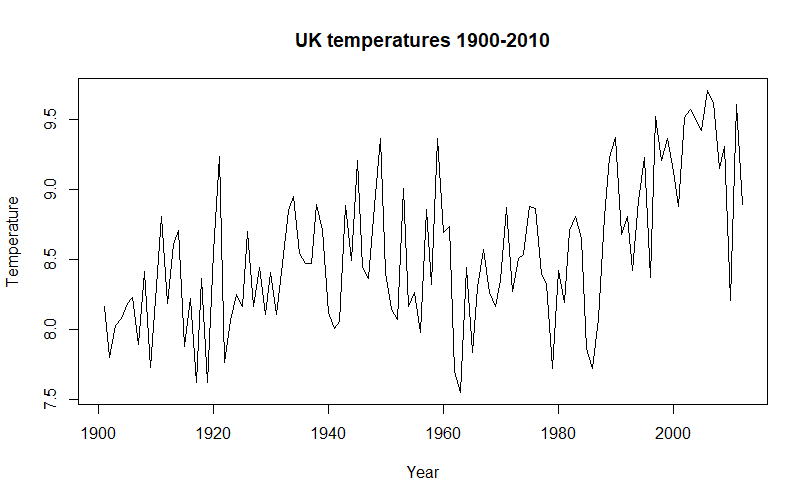
variables. Plotting the temperature data helps see its behavior over the
selected time span.
plot(gbr.historical$year,
gbr.historical$data,type = 'l',xlab = 'Year',
ylab
= 'Temperature',main = 'UK temperatures 1900-2010')
The
positive correlation trend is visible, but some undulation in the plot
trend may explain the 0.52 correlation value. The script computes three
regression models: a linear model, a model that includes a quadratic
term, and a model that includes a quadratic and a cubic term.
#
compute three regression models
lmTemp
<- lm(gbr.historical$data ~ gbr.historical$year) # linear model
qdTemp
<- update(lmTemp, . ~ . + I(gbr.historical$year^2)) # quadratic
model
cuTemp
= update(qdTemp, . ~ . + I(gbr.historical$year^3)) # cubic model
The
linear model uses the year as a predictor of the temperature. The
quadratic model uses the year plus the year squared to predict the
temperature. The cubic model uses
the year plus the year squared plus the year cubed to predict the
temperature. The function below will evaluate the three models, given
their coefficients, so that each model can be converted to a curve that
can be added to the temperature plot.
#
a function to evluate a polynomial given its coeficients to plot the
regression models
polynomial
= Vectorize(function(x, ps) {
n
= length(ps)
sum(ps
* x^(1:n-1))
},
"x")
This
function computes each predicted regression value for each input year
and outputs a vector of the paired values [regression value, year]. Now
for the complete plot with the regression curves.
#
plot the temperature data and the regression models
plot(gbr.historical$year,
gbr.historical$data,type = 'l',xlab = 'Year',
ylab
= 'Temperature',main = 'UK temperatures 1900-2010')
curve(polynomial(x,
coef(lmTemp)), add = TRUE, col = 'red') # add the linear model
curve(polynomial(x,
coef(qdTemp)), add = TRUE, col = 'black', lty=2) # add the quadratic
model
curve(polynomial(x,
coef(cuTemp)), add = TRUE, col = 'blue') # add the cubic model
legend(1900,
9.7, legend = c("linear", "quadratic", "cubic"), lty = c(1,2,1), col =
c('red','black','blue'))

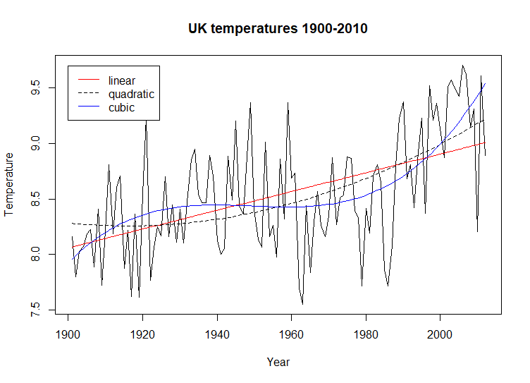
The
regression lines help understand what is going on in this plot. There is
a positive linear trend when the linear model is considered, but between
1945 and 1962 there is also a downward trend. The quadratic regression
curve does not address this downward trend, but it reflects an
acceleration in the upward trend after 1980. the cubic model fits the
temperature data best. It also reflects the downward trend, indicating
that this trend started near 1930 and became and upward trend again in
1960. While beyond the scope of this article, It would be an interesting
project to study whether the reduction in industrial output from the
Great Depression reversed any upward trend in temperatures and the
resumption of production for World War II reinvigorated and accelerated
that trend.
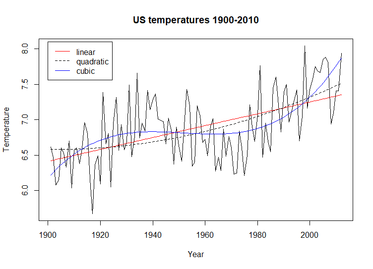
This
analysis is repeated, this time looking at the historical temperature
data for the United States over the same time span.
This
chart exhibits behavior similar to the UK plot above. The overall linear
trend is positive and increases with the year. There is a downward trend
that matches the one in the UK data. The overall temperature plot
appears to be tighter [high and low temperatures closer together for
each year] and the cubic regression model fits the plot better.
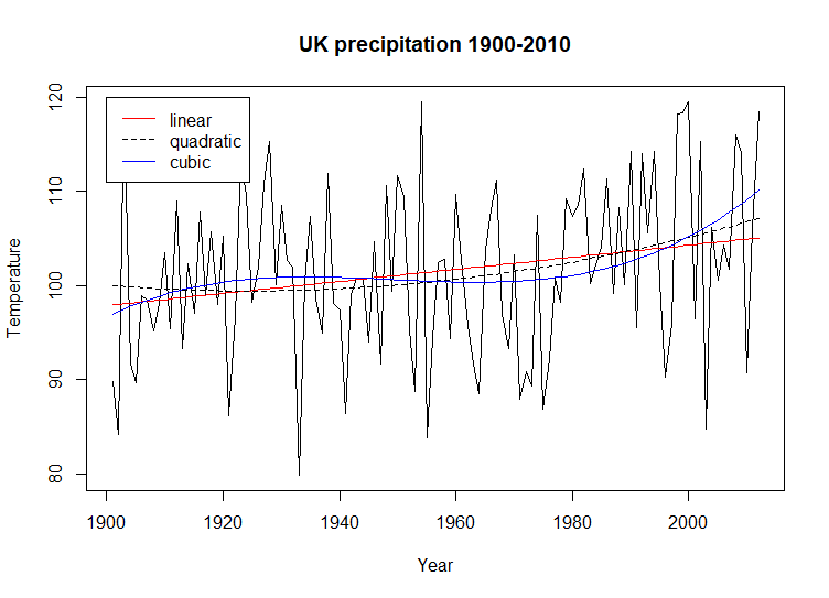
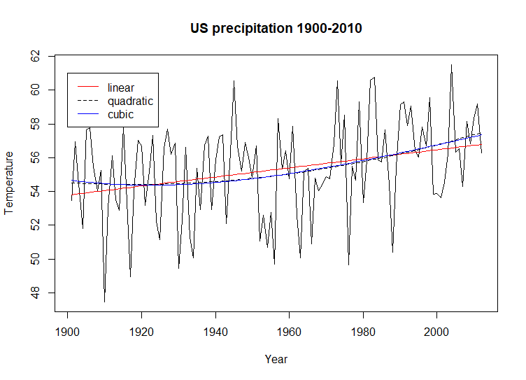
The
example script repeats these steps for the historical precipitation data
for the UK and the US. Here are the two historical precipitation charts
with regression curves.
Both
of these historical precipitation charts exhibit a small upward trend
[linear regression]. Neither chart shows the obvious undulation that is
visible in the historical temperature charts. An interesting observation
regarding the chart for US historical precipitation is the similarity of
the quadratic and cubic regression models. The UK precipitation data
supports undulation in the cubic regression but the US data does not.
An
extension of this exercise can be a good resource to study the issues
associated with climate change. The World Bank data can compare
different regions of the earth. Weather data can be combines with other
World Bank data such as population, financial, or geographic. This
exercise is simply a demonstration of what is available from the World
Bank Open Data Repository. The references below include a more
extensive tutorial of the rWBclimate package.
