This
article will demonstrate how to add additional content to a chart to
enhance it and make it easier to understand.
Here
is an R script with the code for all of the examples in this article:
Here
is the dataset used in the examples in this article:
Here
are links to each of the topics in this presentation:
We can easily add emphasis to a
chart by adding lines that indicate particular values. Here is an
example where lines are used to indicate the variable means in a
bivariate normal sample.
#
load a bivariate normal dataset centered at (3,2)
load('bivn.RData')
#
plot the sample
plot(bivn,
xlab = 'x', ylab = 'y', main = 'bivariate normal sample')
abline(v
= mean(bivn[,1]), lty=2, col='red') # plot a line for the x mean
abline(h
= mean(bivn[,2]), lty=2, col='red') # Plot a line for the y mean
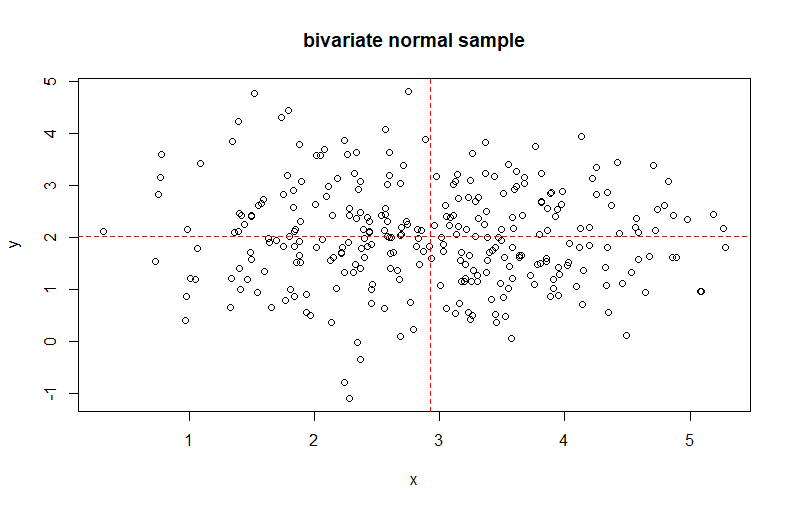
The scatter plot now shows a red
dashed line indicating the means for the x and y variables. The abline( )
function will draw a line on the current chart. In this example, the
first call to abline( )
draws a vertical red dashed line at the mean of the x variable of the
sample. the second call to abline( ) draws a horizontal red dashed
line at the mean of the y variable of the sample. The intersection of
the two lines is clearly the center of mass for the bivariate sample.
We can add text to the chart shown
above that will label the lines and the center of mass.
#
add text to the chart #######################################
text(3.2,-0.9,
'mean x', col = 'red') # label for mean(x) # label for mean(x)
text(0.4, 2.5, 'mean y', col = 'red') # label for mean(y) # label for
mean(y)
text(2.9,2.3,
'center of mass', col = 'blue') # label for center of mass
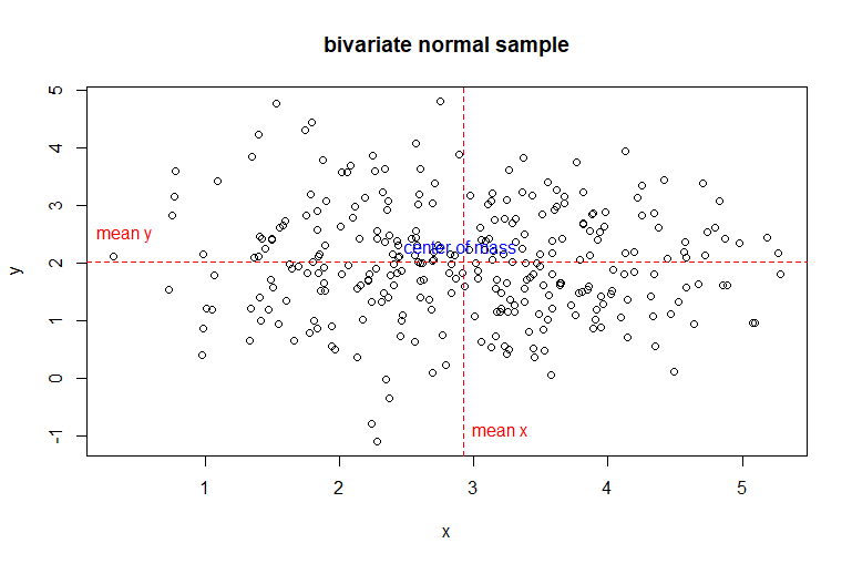
The scatter plot now shows a red
dashed line indicating the means for the x and y variables. Both of
these lines are labeled with red text indicating that they represent
the mean for that variable. These labels are created using the text( )
function which will draw text onto the current chart. The first two
arguments of this function indicate the coordinates of the center of
the text string. These coordinates are expressed in the units of the x
and y axes. The third argument is the designated text string. The
fourth argument is the color of the text label. The intersection of
the two lines is clearly the center of mass for the bivariate sample
and it is labeled in blue text stating that it is the center of mass.
We can enhance the labels in the
chart above by using arrows that will indicate what specific graphic
object the labels describe.
#
adding arrows to the chart ##################################
arrows(2.7,
-1.6, 2.95, -1.6, length = 0.1, angle = 15, col = 'red') # arrow for
mean(x)
arrows(1,
2.5, 1, 2.0, length = 0.1, angle = 15, col = 'red') # arrow for
mean(y)
#
relocate the center of mass label
text(4,-0.5,
'center of mass', col = 'red') # label for center of mass
arrows(4,
-0.2, mean(bivn[,1]), mean(bivn[,2]), length = 0.1, angle = 15, col =
'red') # arrow for center of mass
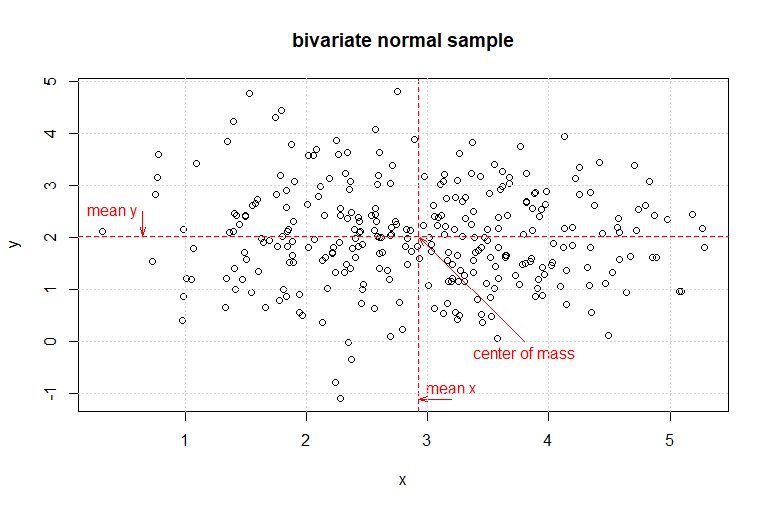
The arrows clearly indicate what
graphic elements the labels refer to. Additionally, because we are
using an arrow to indicate the actual center of mass, the label
"center of mass" is relocated where it is easier to read. The
arguments for the function arrows( ) indicate the coordinates of the
start point of the arrow [first two arguments expressed in the units of the
x and y axes], the end point of the arrow [third and
fourth arguments expressed in the units of the
x and y axes], the length of the edges of the arrow
head [expressed in inches], the inside angle of the arrow head, and
the color of the arrow. This chart is easier to understand when
compared to the first chart at the top of this article.
We can easily add grid lines to
the chart above as a final enhancement.
grid()
# add grid lines to the existing chart
The grid(
) function draws a
light grey grid aligned with the chart tic marks onto the current
chart. This example uses the default arguments. Other argument values
can indicate a different grid alignment and grid line type, color, and
thickness.
Graphic elements can also be added
to a chart for a touch of emphasis or focus. Some graphic elements are
included in the base graphics package. Here is an example using
several of these elements.
#
Adding graphic elements to charts ################
#
create an empty plot
plot.new()
# define the plot
plot.window(c(0,100),c(0,100),asp
= 1) # define dimensions
box()
# surround the plot with a frame
#
define coordinate objects
x0
<- c(5,10,15)
y0
<- x0
x1
<- x0 + 5
y1
<- y0 + 60
#
draw line segments
segments(x0=x0,
x1=x1, y0=y0, y1=y1, lty = 1:3)
#
draw a rectangle
rect(80,25,95,80,border
= 'black', lwd = 3)
#
draw a filled ploygon
polygon(50+25*cos(2*pi*0:8/8),
50+25*sin(2*pi*0:8/8),col = gray(0.8), border = NA)
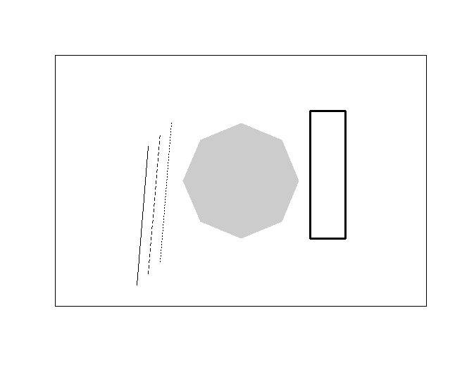
The first three lines of code
declare a plot area, define its size, and surround it with a border.
Next, four coordinate objects are defined. These objects are used to
draw three line segments using three different line styles [solid (1),
dashed (2), and dotted(3)]. A black rectangle with a thick border (lwd
= 3) is drawn next. Finally, a gray polygon is drawn. This call to the
polygon( ) function uses trigonometric functions to define the polygon
vertices in this example.
The
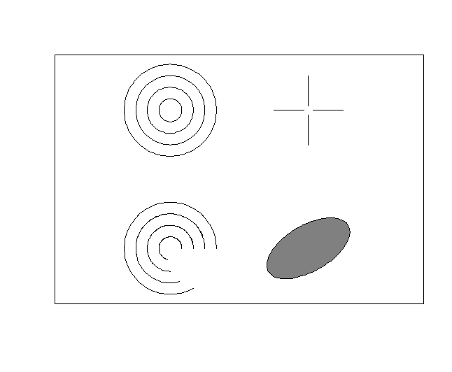
next example will demonstrate some graphics elements using the plotrix
package.
#
Adding graphic elements from the plotrix package ###############
install.packages('plotrix')
library(plotrix)
#
create an empty plot
plot.new()
# define the plot
plot.window(c(0,100),c(0,100),asp
= 1) # define dimensions
box()
# surround the plot with a frame
#
draw concentric arcs
draw.arc(20,
20, (1:4)*5, deg2 = 1:20*15)
#
draw concentric circles
draw.circle(20,
80, (1:4)*5)
#
draw a tilted ellipse
draw.ellipse(80,
20, a = 20, b = 10, angle = 30, col = gray(0.5))
#
draw target cross hairs
draw.radial.line(start
= 2, end = 15, center = c(80,80), angle = 0)
draw.radial.line(start
= 2, end = 15, center = c(80,80), angle = pi/2)
draw.radial.line(start
= 2, end = 15, center = c(80,80), angle = pi)
draw.radial.line(start
= 2, end = 15, center = c(80,80), angle = 3*pi/2)
This example begins by creating an
empty plot area with a black frame. Four concentric arcs of increasing
radius are drawn centered at (20,20) drawing the arcs
counter-clockwise from 1 to 300 (20*15) degrees. the process is
repeated drawing four concentric circles of
increasing radius centered at (20,80). A tilted
ellipse is drawn centered at (80,20). The ellipse is tilted 30 degrees
and filled with transparent gray (50% opaqueness). Finally, four
radial lines are drawn centered at (80,80) forming a focus cross hair.
We
will complete this section using a graphic element to enhance the
bivariate normal plot we produced above. The code below will redraw the
original plot using coordinates for the text and arrow elements using
relative coordinate values. After finishing the chart a transparent (25%
opaqueness) red circle indicating the center of mass of the sample is
added.
#
a practical example using the bivariate normal sample exercise
##############
#
replot the sample - refresh the chart
plot(bivn,
xlab = 'x', ylab = 'y', main = 'bivariate normal sample')
abline(v
= mean(bivn[,1]), lty=2, col='red') # plot a line for the x mean
abline(h
= mean(bivn[,2]), lty=2, col='red') # Plot a line for the y mean
#
add the text labels
text((mean(bivn[,1])-0.5),(mean(bivn[,2])-2.6),
'mean x', col = 'red') # label for mean(x) # label for mean(x)
text((mean(bivn[,1])-2.2),(mean(bivn[,2])+0.3),
'mean y', col = 'red') # label for mean(y) # label for mean(y)
#
add arrows for the labels
arrows((mean(bivn[,1])-0.5),(mean(bivn[,2])-2.8),
(mean(bivn[,1])-0.05),(mean(bivn[,2])-2.8), length = 0.1, angle = 15,
col = 'red') # arrow for mean(x)
arrows((mean(bivn[,1])-1.9),(mean(bivn[,2])+0.3),
(mean(bivn[,1])-1.9),(mean(bivn[,2])+0.05), length = 0.1, angle = 15,
col = 'red') # arrow for mean(y)
#
the center of mass label
text((mean(bivn[,1])+1.0),(mean(bivn[,2])-2.3),
'center of mass', col = 'red') # label for center of mass
arrows((mean(bivn[,1])+1.0),(mean(bivn[,2])-2.2),
mean(bivn[,1]), mean(bivn[,2]), length = 0.1, angle = 15, col = 'red') #
arrow for center of mass
#
adding grid lines to the chart ################################
grid()
# add grid lines to the existing chart
#
define a transparent red (25%density)
myred
<- rgb(255, 0, 0, max = 255, alpha = 64, names = "red25")
#
draw a transparent circle at the center of mass
draw.circle(mean(bivn[,1]),
mean(bivn[,2]), 0.25, col = myred, border = myred)
This is an empty template page
which acts as a placeholder for this topic. Once the actual content
page for this topic is complete, it will be posted and replace this
page.
x
<- c(1, 2, 3, 4, 5, 6, 7, 8, 9, 10) # code example
This is an empty template page
which acts as a placeholder for this topic. Once the actual content
page for this topic is complete, it will be posted and replace this
page.
x
<- c(1, 2, 3, 4, 5, 6, 7, 8, 9, 10) # code example
This is an empty template page
which acts as a placeholder for this topic. Once the actual content
page for this topic is complete, it will be posted and replace this
page.
x
<- c(1, 2, 3, 4, 5, 6, 7, 8, 9, 10) # code example
