Base charts and plots in R
One of the advantages of R is being able to easily visualize data in a
chart. This article will discuss the functions of the R graphics package, often referred to as R
base graphics. R graphics can be divided into three topics: high-level
graphics [functions that create a new chart], low-level graphics
[functions that add content to an existing chart], and graphical
parameters [arguments that modify or enhance graphics components]. This
article will address high and low-level graphical functions. Graphical
parameters are introduced but they will be covered in more detail in the
article on Charting and plotting function arguments.
High-level
charts and plots in R
High-level graphics in R plot your data in a new chart using the
modification arguments you choose. Here is a simple example:
x
<- c(1:50) # a set of numeric values
plot(x)
# a scatter plot of the set x
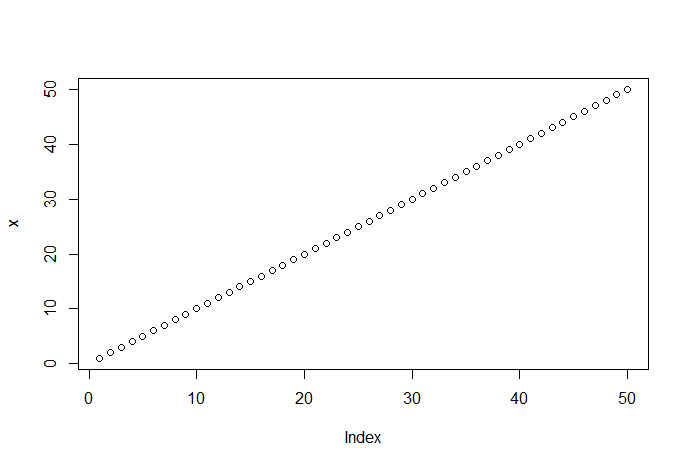
These commands produce the following chart:
Each data value is plotted on the chart as a small empty dot. This is
the default plot setting. We can override this default using the point
[pch = ] graphics argument. The plot( ) function uses the data indices
as the x-axis values and the actual data values as the y-axis values of
this chart. Since the data values are in order (1 to 50), the dots
ascend, left to right, in order. Let's scramble the data values and
regenerate the plot.
x
<- sample(x, 50) # randomly sample the numeric values
plot(x,
main = 'Random scatter plot example') # a scatter plot of the set x
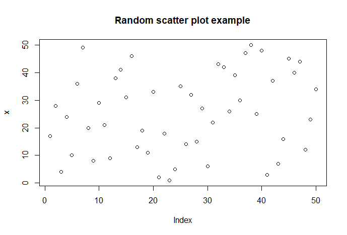
These commands produce the
following chart:
Now
the data values are shown in a random order. Notice that the x-axis is
automatically labeled Index and the y-axis is automatically labeled X.
The argument main = 'Random scatter plot example' adds a
title to out chart. Graphics arguments will be introduced and briefly
discussed in this article. The article on Charting
and plotting function arguments will provide more detail about them and
their use.
The charts above use the univariate data in x, therefore the data index
is the default x value for each point. If we use bivariate data [paired
data values], the first value of each pair will be the x value and the
second value will be the y value. Here is a chart of the
While you can do many operations in R using data objects that contain a
single data item, most of the interesting things you will want to do
will involve data objects that contain multiple data items. The
exercises in this learning infrastructure topic will help familiarize
you with R multiple data item objects like vectors, matrices, and data
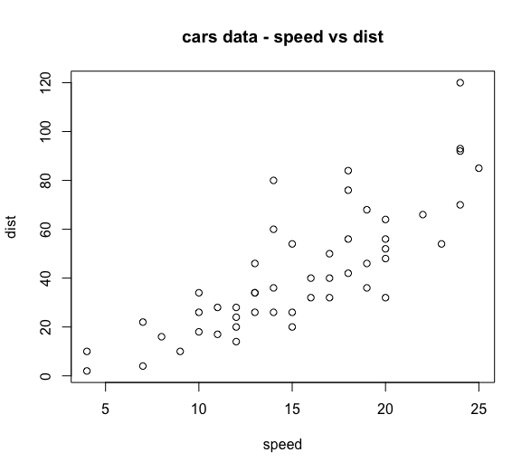
frames. Here is a scatter plot of the cars dataset
from the datasets package.
plot(cars,
main = 'Speed versus Stopping distance') # a scatter plot of the cars
dataset
The cars dataset consists of two columns of data values: speed and dist.
The data value pairs are treated as the x and y coordinates for each
point on the chart. The column titles are used as the default labels for
the x and y axes [hint: use the command head(cars) to view the column
titles and the first 6 rows of data]. The x and y axes can also be
specified in the plot( ) function. This allows the plotting of any pair
of variables in a multi-variable dataset. Using the cars dataset we can
use either of these two commands:
plot(cars$speed,
cars$dist, main = 'Speed versus Stopping distance') # a scatter plot of
the cars dataset
plot(cars$dist
~ cars$speed, main = 'Speed versus Stopping distance') # a scatter plot
of the cars dataset
The first command identifies the values of cars$speed as the x-axis and
the values of cars$dist as the y-axis. The second command uses the R
formula interface to identify the x and y axes. The formula interface is
result ~ predictor. In this case, the cars$speed
[x-axis] predicts the cars$dist [y-axis]. Verify for yourself that these
commands result is charts that are similar to the figure above. Notice
how the plot( ) function automatically labels the x and y axes for these
commands. The article
on Charting and
plotting function arguments will provide more detail on how to
override the automatic labels.
This
article was an overview of how to create charts and plots in R. The next
article presents a survey of the base plotting functions.
It will demonstrate how to use many of the base plotting
functions to chart your data.


