The
hist( )
function creates a vertical bar chart showing the frequency of the
data values in the range of each bar in the chart [function
documentation]. Originally, histograms were used for
discrete data, but R can compute intervals for continuous data. This
chart can help visualize the distribution of the data. Histograms only
chart a single variable. Here is an example using the waiting time
data [discrete values] in the Old Faithful geyser dataset in the
datasets package
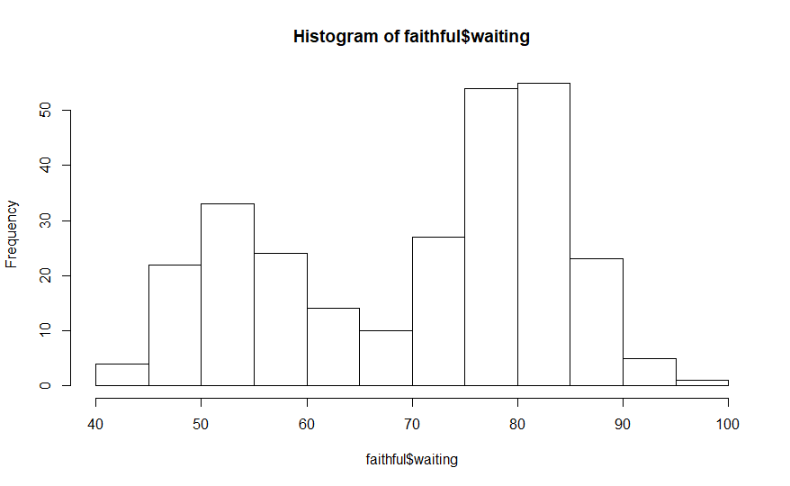
hist(faithful$waiting)
# code example
The
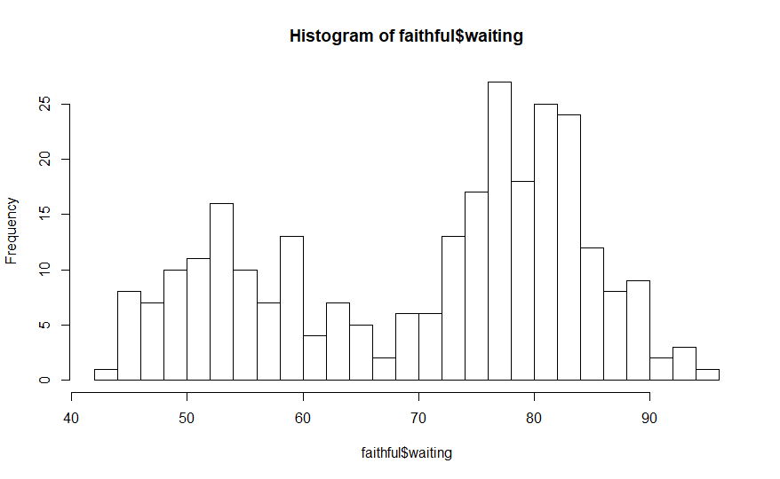
histogram above organizes the 272 elements in the waiting time
variable of the faithful dataset into 10 intervals. This is the
default number of intervals for this function but it can be changed
using the breaks
argument. Here is an example that displays this data in 20 intervals.
hist(faithful$waiting,
breaks = 20) # code example
The
increased
number of intervals provides a more detailed visualization of the
distribution of the values in the waiting time data.
This
discussion was a brief introduction to the hist(
) function. The
output of this function can be customized using its various arguments.
That is addressed in the article
Charting
and plotting function arguments.
The
density( )
function is different than the other functions in this article
[function documentation].
It computes a density curve for a single data variable but it does not
plot a chart. The output of this function must be presented as the
input data in the plot( ) function to visualize the density
chart.
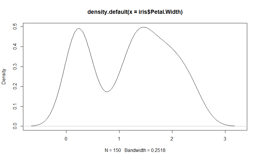
iris_density
<- density(iris$Petal.Width) # code example
plot(iris_density)
#
or
plot(density(iris$Petal.Width))
# another example

Both
sets of commands above create the same chart. The first set of
commands, computes the density information for the iris petal width
and stores it in an object named iris_density. The second command plots the
density information. The second version of the example, plots the
output of the density( ) function.
This
discussion was a brief introduction to the density(
) function. The
output of this function can be customized using its various arguments.
That is addressed in the article Charting
and plotting function arguments.
The
boxplot( )
function is useful to visualize the descriptive statistics and shape
of the values in a dataset [function documentation].
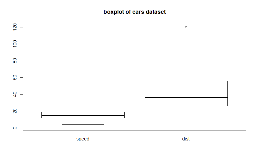
It depicts the minimum, 25% quantile, medium, 75% quantile, maximum,
and any possible outliers. Here is a boxplot of the cars dataset from
the R datasets package:
boxplot(cars,
main = 'boxplot of cars dataset') # code example
The
chart
shows both variables in the dataset. The minimums and maximums are
depicted with the horizontal bars at the bottom and top of each plot.
The 25% and 75% quantiles are the bottom and top boundaries of the
boxes. The medians are the bold horizontal lines inside the boxes. The
dot above the dist plot is an outlier. Compare the ranges of these
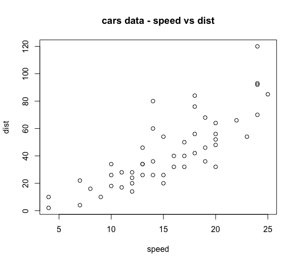
plots to the variable ranges in the plot( ) chart at the top of this
article. This chart focuses on the descriptive statistics and value
distribution of each variable separately. The plot(
) chart shows the
paired relationship between the two variables.
The
boxplot( )
function will chart any number of variables in a single chart. Here is
a boxplot of a 14 variable dataset:
boxplot(wine,
main = 'boxplot of wine dataset') # code example
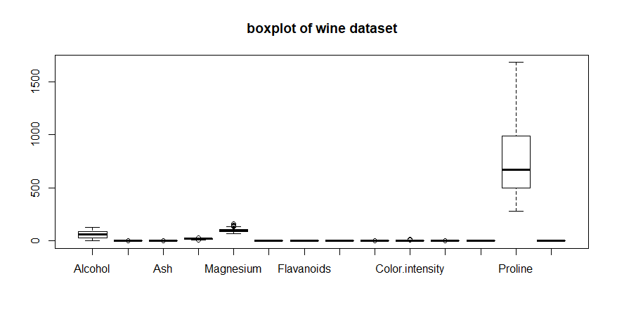
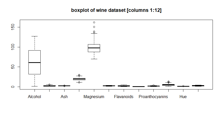
The
range of values for the variable Proline dominates all of the other
variables in determining the range of the y-axis. Here is another
boxplot using the first 12 variables:
boxplot(wine,
main = 'boxplot of wine dataset') # code example
Limiting
the plotted variables helps a bit, but there are still several
variables whose ranges are so small that their boxplots are not all
that informative. This is also a good demonstration of the effect the
automatic axis range determination in the R charting functions have on
a chart.
This
discussion was a brief introduction to the boxplot(
) function. The
output of this function [for example, explicitly setting the axis
ranges] can be customized using its various arguments. That is
addressed in the article Charting
and plotting function arguments.
The
qqnorm( )
function plots a quantile-quantile plot of a single variable versus a
sample normal distribution [function documentation].
In a quantile-quantile plot, the variables are sorted, ordered by
their quantile values, and paired. The paired data is plotted. The
normal reference data describes the x-axis and the input sample data
describes the y-axis of the paired data coordinates. If the two
variables share the same distribution, the resulting plot will
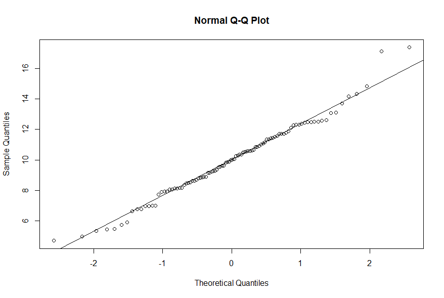
describe a diagonal line corresponding to the line y = x. Here is an
example using a sample of data from a normal distribution with mean of
10 and standard deviation of 3:
x
<- rnorm(100, 10, 3) # sample
qqnorm(x)
# qqnorm chart
qqline(x)
# add a reference line
The
points
align with the reference line [output from the qqline(
) function], so
this sample is essentially a normal distribution [function documentation].
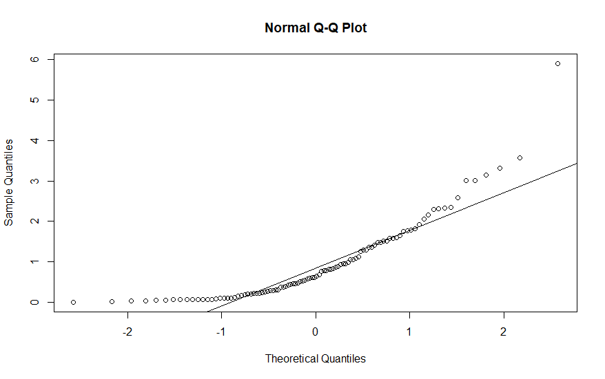
Here is an example using a sample from an exponential distribution
with default parameters:
x
<- rexp(100) # sample
qqnorm(x)
# qqnorm chart
qqline(x)
# add a reference line
The
points
in this chart clearly deviate from the reference line. This
indicates that our sample does not have a normal distribution. The qqnorm( )
function does not replace numeric statistical tests like the
Shapiro-Wilk test, but it does provide a visualization of whether or
not a sample has a normal distribution.
This
discussion was a brief introduction to the qqnorm(
) and qqline( )
functions. The output of these functions can be customized using its
various arguments. That is addressed in the article Charting
and plotting function arguments.
The
qqplot( )
function is similar to the qqnorm(
) function, but it
plots one input sample versus another input sample [function documentation].
This process graphically tests whether the two samples exhibit the
same data distribution and can compare any distributions. Here is an
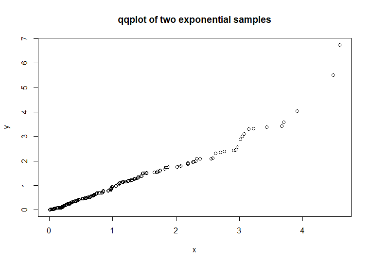
example using two exponential distributions:
x
<- rexp(200) # code example
y
<- rexp(200)
qqplot(x,y,
main = 'qqplot of two exponential samples')
The
paired data of the two samples forms a diagonal line. This indicates
that the two samples are similar. The paired point deviations on the
right end of the chart is due to the randomness of the samples, not
any actual distribution dissimilarities. This deviation is a good
example of the limitations of these graphical techniques in
determining the similarity or dissimilarity of two samples. These
techniques can supplement numeric measures of similarity or
dissimilarity, but should not be used as a sole replacement. Here is
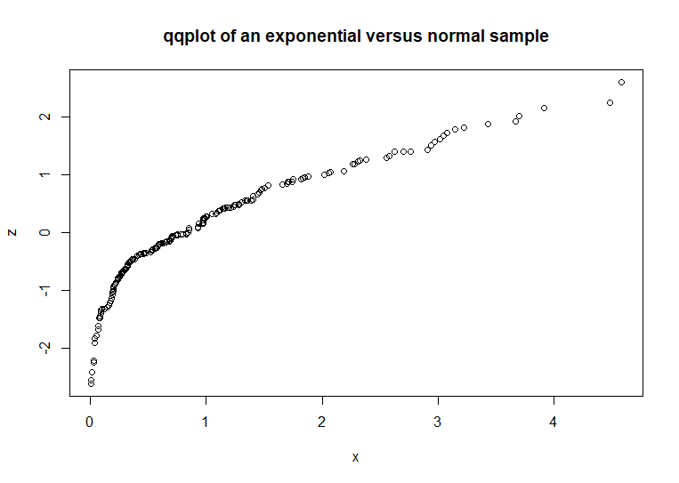
an example that compares an exponential sample to a normal sample:
x
<- rexp(200) # code example
z
<- rnorm(200)
qqplot(x,z,
main = 'qqplot of an exponential versus normal sample')
Compare
this chart to the previous chart. The significant arc in the left
side of this chart indicates that the two samples are of dissimilar
distributions. While qqplot( ) should not be used as a
substitute for numeric measures of similarity or dissimilarity, it
can be a quick check of sample distribution comparisons.
This
discussion was a brief introduction to the qqplot(
) function. The
output of this function can be customized using its various
arguments. That is addressed in the article Charting
and plotting function arguments.
An
example earlier in this article, showed how the plot(
) function created
a scatter plot chart for more than two variables. This chart is
similar to the chart produced by the pairs(
) function. The
pairs( ) function will plot multivariate data as a set of scatter
plots, each plot compares two of the variables [function documentation].
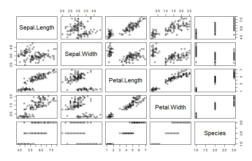
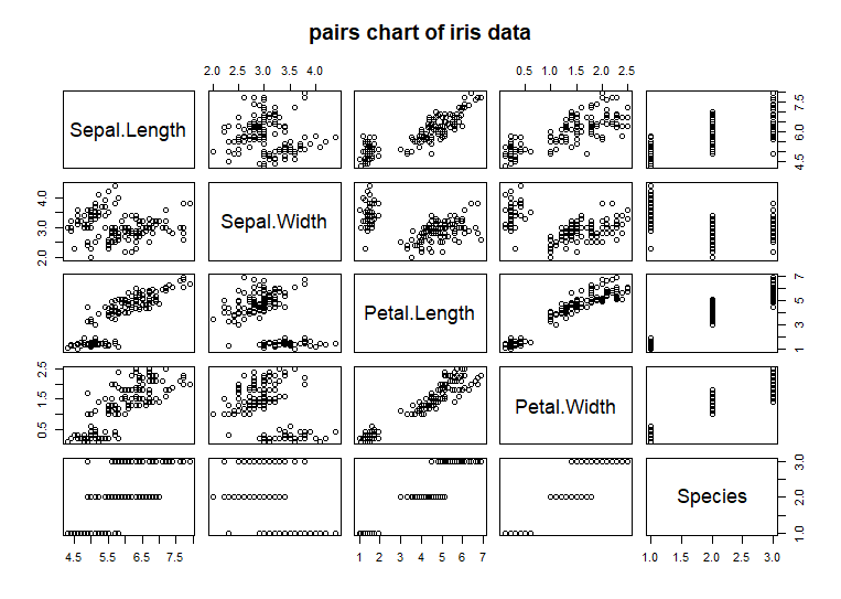
Here is a plot of the iris data using the pairs(
) function:
pairs(iris,
main = 'pairs chart of iris data') # code example
Each
row in this example chart represents one of the variables [columns]
in the iris dataset. Each column also represents one of the
variables. Therefore each chart shows the paired data for one
variable [column of chart -> x-axis] versus another variable [row
of chart -> y-axis]. The last row and column are the categorical
variable Species. When Species is plotted versus any of the other
numeric variables, they form three lines representing the range of
values for that numeric variable stratified by Species. All of the
chart panels along the main left to right downward diagonal
represent a variable plotted against itself. These charts are not
displayed because the result is trivial. The variable name is
displayed instead as a row-column label.
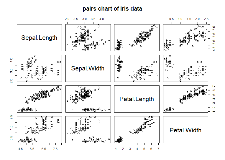
pairs(iris[,-5],
main = 'pairs chart of iris data') # code example
This
discussion was a brief introduction to the pairs(
) function. The
output of this function can be customized using its various
arguments. That is addressed in the article Charting
and plotting function arguments.
