Charting and plotting
function arguments
The previous article, A
survey of base plotting functions, introduced several
useful base R plotting functions. This article will discuss how their
charts can be enhanced or customized by modifying the default
function arguments.
This discussion will start with an
example using the iris data and the plot(
) function [function
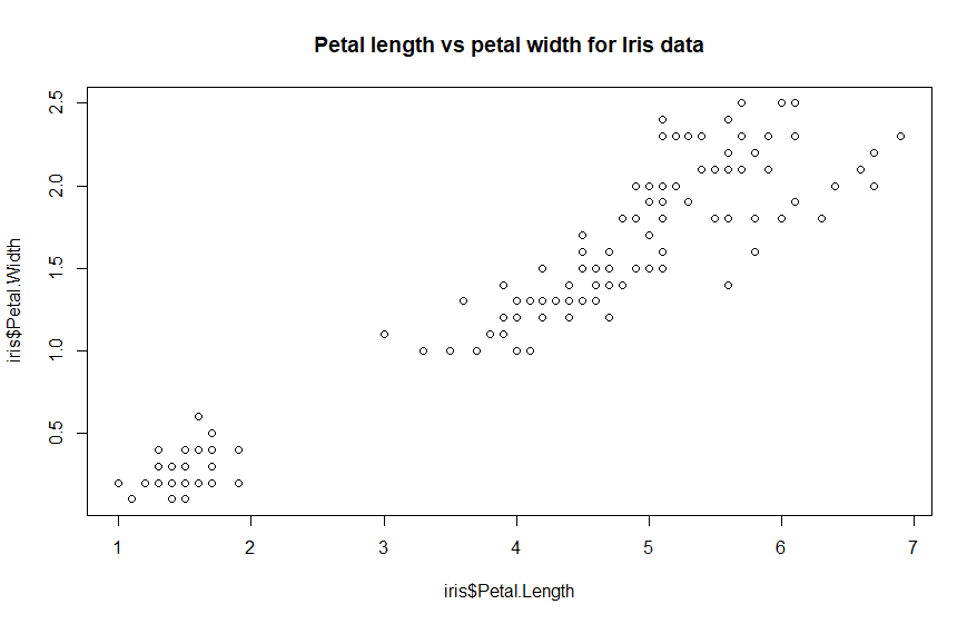
documentation]. Here is a chart of the iris data from the
previous article:
plot(iris$Petal.Length,
iris$Petal.Width, main = 'Petal length vs petal width for Iris data') #
code example
This chart already uses one
argument [main = 'Petal length vs
petal width for Iris data'
] to specify a main chart title. The x and y axes are labeled with the
function defaults [the specified attribute names]. Those labels can be
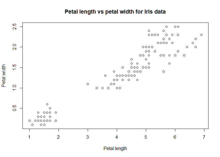
cleaned up using the arguments for the axis labels. This example
specifies the axis labels using the arguments xlab
= 'Petal length' and
, ylab = 'Petal width':
plot(iris$Petal.Length,
iris$Petal.Width, xlab = 'Petal length', ylab = 'Petal width',
main = 'Petal length vs petal
width for Iris data') # code example
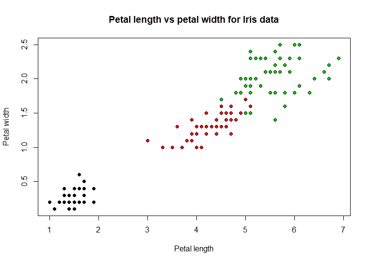
Our chart is shaping up. The dots
in the chart represent the paired values for the petal length and
petal width for the individual flowers. Notice the cluster of dots in
the lower left corner. Each flower belongs to a species of iris. If
the dots were colored differently for each species, a pattern might
emerge that could
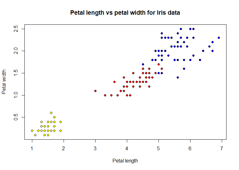
explain that cluster. This example will specify a type of dot that can
be colored [using the argument pch =
21] and then specify
which color based on the species value [using the argument bg = as.numeric(iris$Species)]
plot(iris$Petal.Length,
iris$Petal.Width, xlab = 'Petal length', ylab = 'Petal width',
pch = 21, bg =
as.numeric(iris$Species),
main = 'Petal length vs petal
width for Iris data') # code example
Adding
color to the dots definitely helped show a distinct pattern in the
distribution of iris species based on the paired data values. These two
arguments are not as clear as the other arguments presented above. The
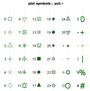
chart points are specified using the pch
= argument. The various
types of chart points are shown in this table
The default point type is 1, an
empty circle. Points 15 through 20 are solid black shapes. Points 21
through 25 are shapes that can be filled with a specified background
color, as show in the example chart above. The various shaped points
are helpful when we want to indicate differences in the data, like the
species of iris, but cannot use color, as when printing in black and
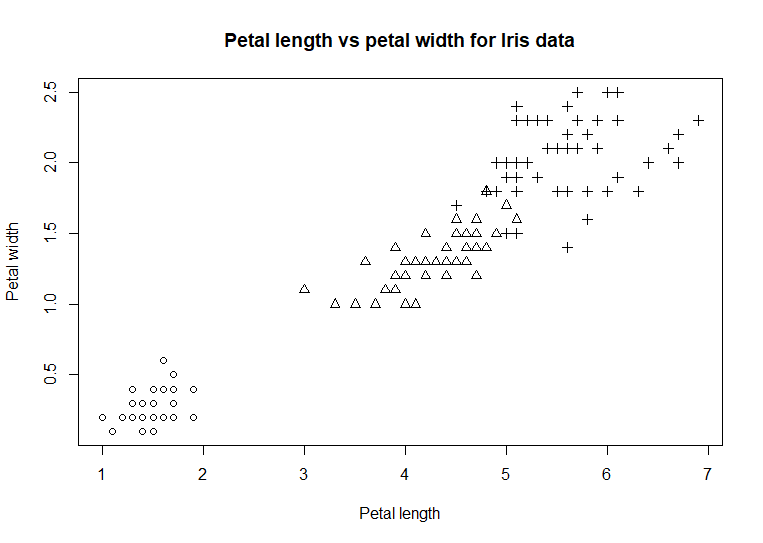
white. Here is the chart using shapes rather than colors
plot(iris$Petal.Length,
iris$Petal.Width, xlab = 'Petal length', ylab = 'Petal width',
pch = as.numeric(iris$Species),
main = 'Petal length vs petal
width for Iris data') # code example
The
function as.numeric( )
is used in the plot( )
commands above to both designate the color of the points or designate
what kind of point. This function converts categorical data, such as
Species, into a sequence of numeric values, 1, 2, and 3 in this example.
Each unique categorical value is converted to an integer, starting at 1,
until all unique values in the data are exhausted. The colored scatter
plot uses the argument to designate the background color of the
points. The colors are specified using the output of the as.numeric(
) function. This
designates both the color for each Species and associates that color to
the paired data points. The colors can be explicitly specified with a
more complex form of the argument bg =
c('yellow', 'red', 'blue')[unclass(iris$sSpecies)].
In this form, a list of numeric values specifies the colors which are
then associated with each label in Species and then they are matched to
the Species labels using [unclass(iris$sSpecies)].
plot(iris$Petal.Length,
iris$Petal.Width, xlab = 'Petal length', ylab = 'Petal width',
pch = 21, bg = c('yellow',
'red', 'blue')[unclass(iris$sSpecies)],
main = 'Petal length vs petal
width for Iris data') # code example
Sometimes,
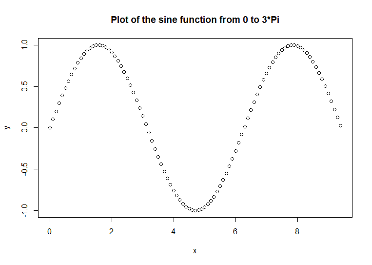
points are not the best way to chart our data. Here is an example of a
plot of the sine function
x <- seq(0, 3
* pi, 0.1)
y <- sin(x)
plot(x, y, main
= 'Plot of the sine function from 0 to 3*Pi') # code example
Normally, function output is not
depicted as points. The typical way that function output is show is as
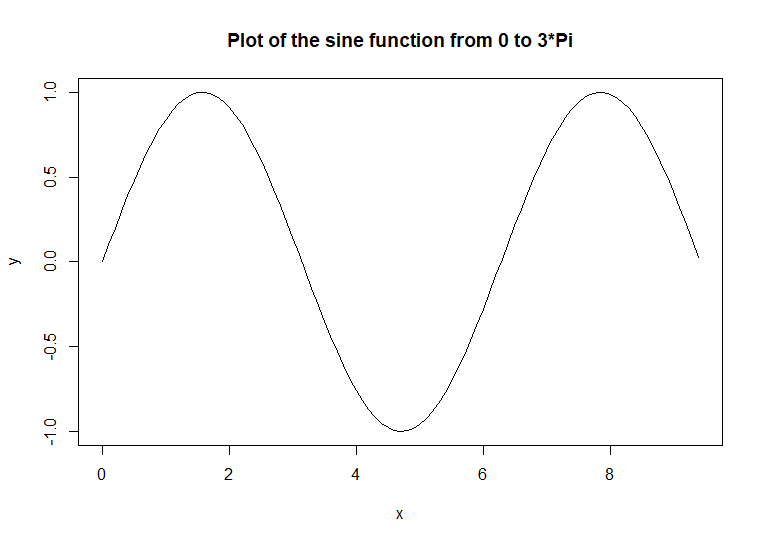
a line chart
plot(x, y, type
= 'l', main = 'Plot of the sine function from 0 to 3*Pi') # code
example
That
chart connects the points with lines. Because the points are 0.1 units
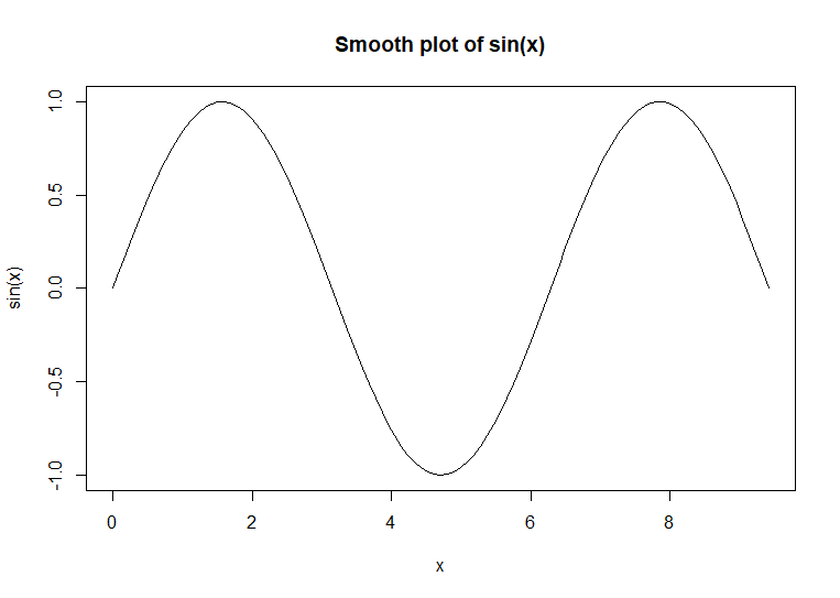
apart, the lines appear to be a smooth line. The curve(
) function is used to
plot smooth curve charts. This function uses the output of a function as
its data input.
curve(sin(x),
main = 'Smooth plot of sin(x)') # code example
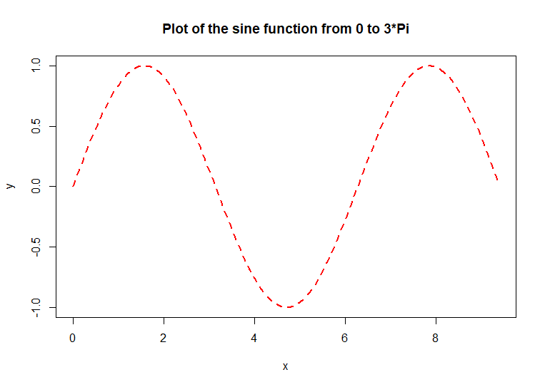
The line in the original plot can
be modified. This example uses a thick red dashed line for the sine
function plot
plot(x, y, type
= 'l', col = 'red', lwd = 2, lty = 2,
main = 'Plot of the sine
function from 0 to 3*Pi') # code example
The col
= 'red' argument
specifies the color of the lines. The lwd
= 2 argument
specified the line thickness [line weight]. The default thickness is
1. A thickness of 2 is twice as thick as the default. A thickness of
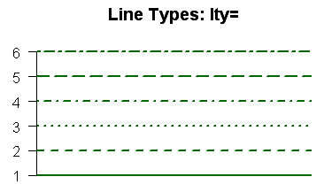
0.5 is half as thick as the default. The lty
= 2 argument
specifies the line type. Here is a table of the various line types
with their numeric codes.
This discussion in this article
presented a quick overview of charting and plotting function
arguments. Most of the arguments discussed in this article can be used
for most R plotting functions. It is always a good idea to consult the
function documentation to verify which arguments
a specific function can accept and what they do to the function. The
next article will address Adding
additional content to charts. Examples of additional content
are: reference lines, text labels, additional lines on the same chart,
and chart legends.
References
